Lighting does more than illuminate a room. It shapes how we perceive a space—not only through brightness, but in the way it reveals color, texture, and material. Lighting isn’t just about brightness or tone: one of the most important factors influencing how a room appears is the Color Rendering Index, commonly referred to as CRI.
So what is CRI exactly? The Color Rendering Index measures how accurately a light source reveals colors compared to natural daylight. In well-designed interiors, that accuracy plays a significant role in how materials and finishes are experienced.
The richness of wood grain, the subtle undertones of paint, the vibrancy of hanging artwork, and even the way skin tones appear in a mirror are all influenced by CRI. Understanding this measurement helps designers and homeowners choose lighting that allows the full character of a room to emerge.
What Is the Color Rendering Index (CRI)?
The Color Rendering Index (CRI) is a measurement used in lighting design to evaluate how faithfully a light source displays the true colors of objects when compared with natural sunlight.
CRI is measured on a scale from 0 to 100, with higher values indicating more accurate color representation. The closer a light source approaches 100 CRI, the more naturally colors appear under that illumination.
Most high-quality residential lighting today falls within the 90–98 CRI range, offering excellent color clarity and visual balance. Lower CRI lighting can cause colors to appear dull, washed out, or distorted. Reds may look muted, whites may shift toward gray, and natural materials such as wood, stone, and fabric can lose depth and nuance.
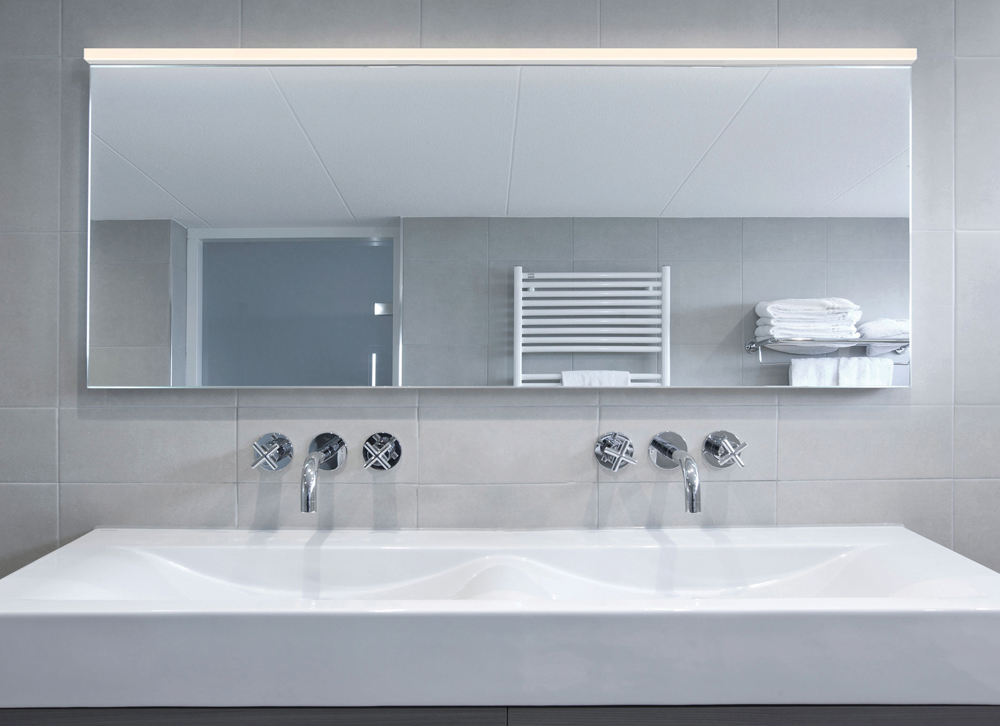
Many people have experienced this effect without realizing its cause—for example, when a mirror lit by harsh lighting makes skin tones appear flat or slightly unnatural. In contrast, lighting with a high CRI reveals colors more faithfully, allowing materials and objects to appear closer to how they look in daylight.
Why High CRI Lighting Matters in Interior Design
In thoughtfully designed interiors, lighting should reveal materials as they were intended to be seen. High-CRI lighting preserves the depth of natural wood, the subtlety of paint colors, and the tonal variation found in textiles, artwork, and architectural finishes.
Low-CRI lighting can subtly flatten a space. Colors appear muted, whites lose clarity, and layered materials begin to blend together. The room may feel dull or visually imbalanced, even if the brightness level itself is sufficient.
Because of this, designers consider CRI alongside other lighting specifications such as lumen output, beam spread, and color temperature. When these elements work together, lighting supports the architecture and materials within a room rather than competing with them.
In residential environments, accurate color rendering contributes to spaces that feel more natural, comfortable, and visually cohesive.
CRI vs Color Temperature: Understanding the Difference
CRI is often discussed alongside color temperature, but the two measurements describe different qualities of light. Color temperature, measured in Kelvin (K), describes the visual warmth or coolness of light. Lower Kelvin values—around 2700K—produce warm, ambient illumination typically used in residential interiors. Higher Kelvin values create cooler, daylight-like lighting.
CRI, by contrast, measures how accurately colors appear under that light. Two light sources may share the same color temperature yet produce very different visual results depending on their CRI rating. A warm 2700K bulb with low CRI can make colors appear muddy or muted, while a 2700K bulb with a CRI above 90 reveals richer tones and clearer detail.
Understanding both measurements helps ensure lighting achieves the right balance between atmosphere and color accuracy. To learn more about color temperature, check out our guide on Understanding Kelvin Color Temperature.
What Is Considered a Good CRI for Home Lighting?
For most residential lighting applications, designers recommend a CRI rating of 90 or higher.
Lighting quality generally falls within the following ranges:
| Rating | CRI Score | What It Means |
|---|---|---|
| Excellent | 90-100 | Colors appear vivid, accurate, and true-to-life |
| Good | 60-85 | Acceptable color accuracy, but some distortion possible |
| Poor | 0-55 | Colors appear washed out or incorrect |
High-CRI lighting is especially valuable in spaces where color accuracy matters, such as kitchens, dressing areas, art displays, and rooms featuring natural materials.
Where High CRI Lighting Makes the Biggest Difference
Although accurate color rendering improves any environment, certain spaces benefit particularly from high-CRI lighting: Kitchens benefit from lighting that accurately reveals food color while improving visibility during preparation. Bathrooms and dressing areas require lighting that shows natural skin tones for grooming and makeup application. Living rooms and bedrooms often feature layered materials such as wood furniture, textiles, and artwork that appear richer under high-quality lighting. And home offices and creative studios benefit from accurate color perception during detailed work.
In each of these environments, lighting supports not only visibility but also the overall experience of the space.
How Designers Choose Lighting with the Right CRI
When evaluating lighting fixtures, professionals typically consider several specifications together:
- Color Rendering Index (CRI) for color accuracy
- Color temperature (Kelvin) for atmosphere
- Lumens for brightness
- Beam spread for light distribution
Many contemporary fixtures feature integrated high-CRI LEDs, which maintain consistent color performance throughout the life of the fixture. Because lighting is often layered, high CRI helps ensure colors remain consistent across multiple sources of illumination.
The Role of CRI in Contemporary Lighting Design
Lighting design today places increasing emphasis on visual comfort, material authenticity, and the overall experience of a space. CRI plays a central role in achieving these goals.
High-quality lighting allows interiors to be experienced more fully. Materials reveal their natural variation, colors appear richer, and architectural details become clearer.
For designers and homeowners alike, understanding the Color Rendering Index is an important step toward selecting lighting that enhances both the appearance and atmosphere of a home.
Explore more guides:
Light Bulb Facts: The Meaning of Lumens
Understanding Kelvin Color Temperature